

The genesis of design: Inspiration and exploration
At Carbines Designs, every creation begins with a journey of discovery. We delve deep into intent, history, and symbolism to craft designs that tell a unique story. Explore our process from initial spark to profound concept.
Where inspiration takes root
Our design journey always begins with understanding. We focus on the customer's intent, the story they wish to convey, and the rich history of the subject matter. Extensive research into these elements, coupled with an exploration of symbolism, forms the bedrock of every new project. This deep dive ensures each design is not just aesthetically pleasing but also imbued with meaning and narrative.
Crafting for a discerning audience
We envision our designs resonating with homeowners, hotel proprietors, interior designers, artists, musicians, and event hosts. These individuals seek a standout statement piece for a traditional home, a contrasting talking point for a modern setting, or simply something unique and unrepeatable. Our creations are tailored for those who desire designs that transcend the ordinary and spark conversation.
From concept to creation
Our process for transforming a raw idea into a finished product is a blend of creative association and rigorous research. We begin with brainstorming and word association, then delve into specific elements, making unexpected connections between symbols and concepts. This unique human thought process, combining association and lateral thinking, allows us to create unusual and impactful finished products that truly make a statement.
Case Study: Signs & Symbols
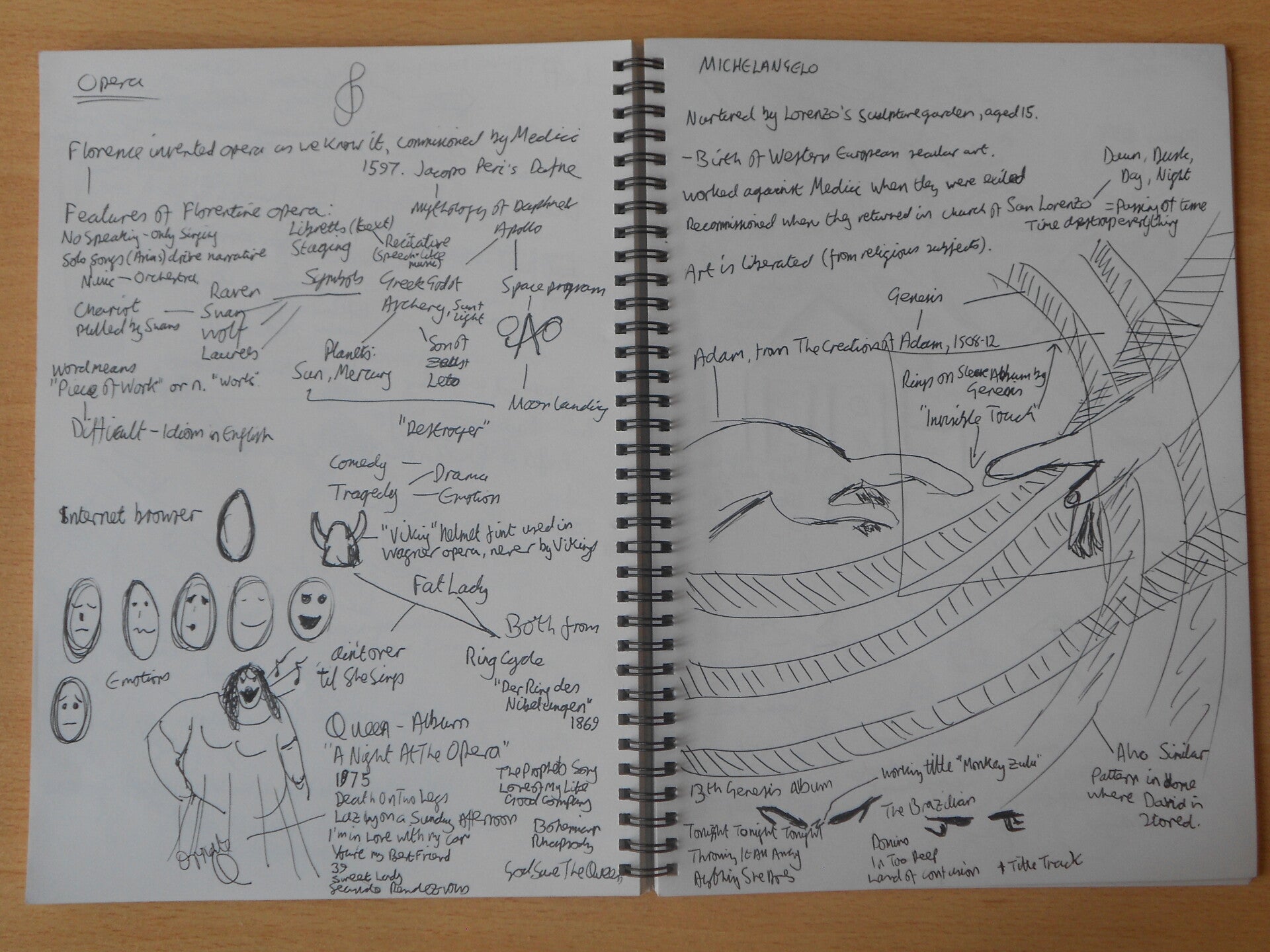
A hand drawn project with research into signs and symbols. The finshed product could be any format and represent 6 elements visually.
The final format of presentation was an LP sleeve: Gatefold to contain all required images
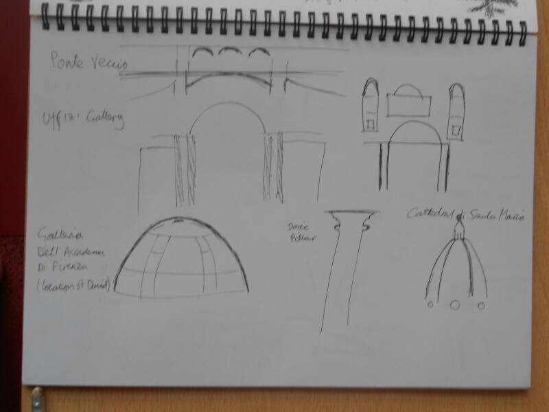
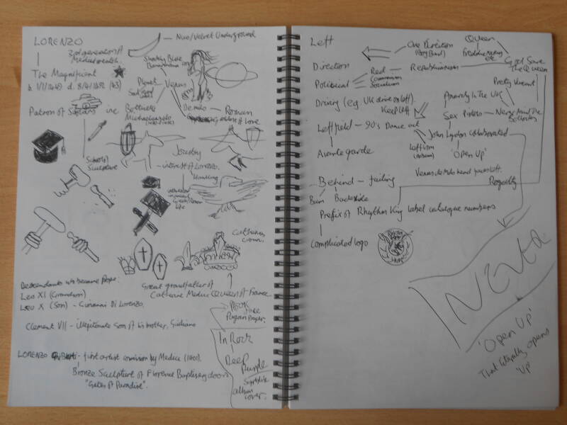
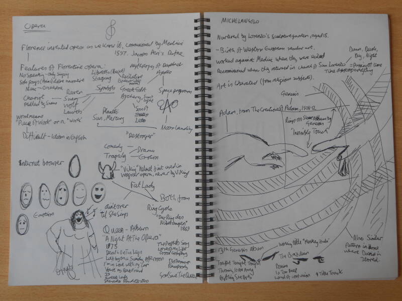
The research, brainstorming and initial sketches of ideas
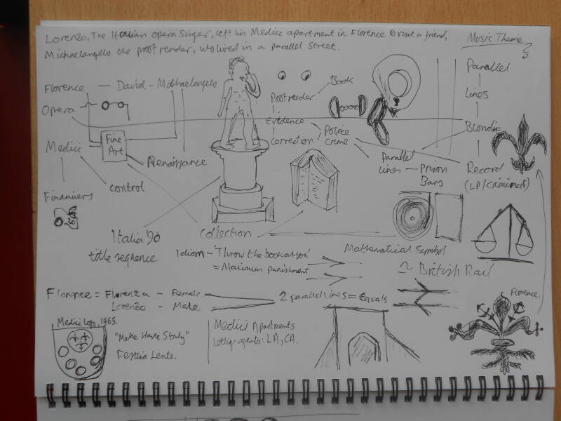
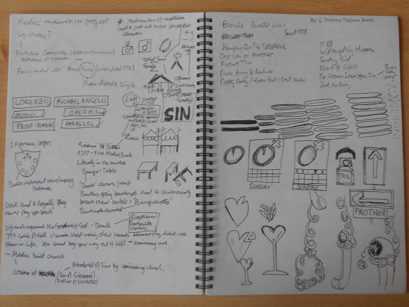
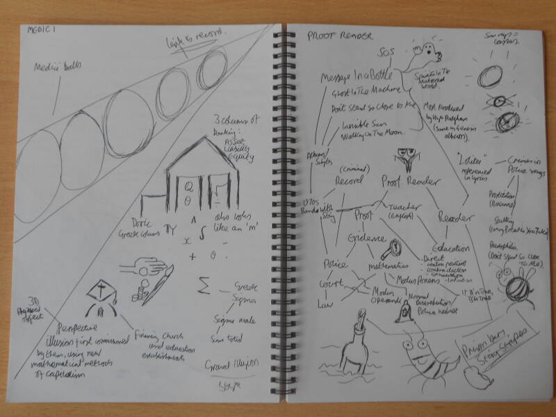
"Lorenzo, the Italian opera singer, left his Medici apartment in Florence to visit a friend. Michaelangelo, the proofreader, who lived in a parallel street."
Each of the 6 elements originated from the above phrase. Because the finished product is an LP sleeve, music is the consistent theme across all elements.
The final product

Chosen element 1: Medici
The front cover of the whole LP. It comprises the 5 balls of the Medici family, early art commissioners from Florence. The art they commissioned is the first in Europe to use the concept of perspective, represented by them disappearing into the distance.
Raphael was a Florentine artist from 1504-08, during which time he probably began work on The School of Athens (maybe soon after when he moved to Rome, as dates are uncertain).
The main character on the cover is from this painting and more famously used on the cover of both Guns n' Roses' Use Your Illusion albums in 1991.
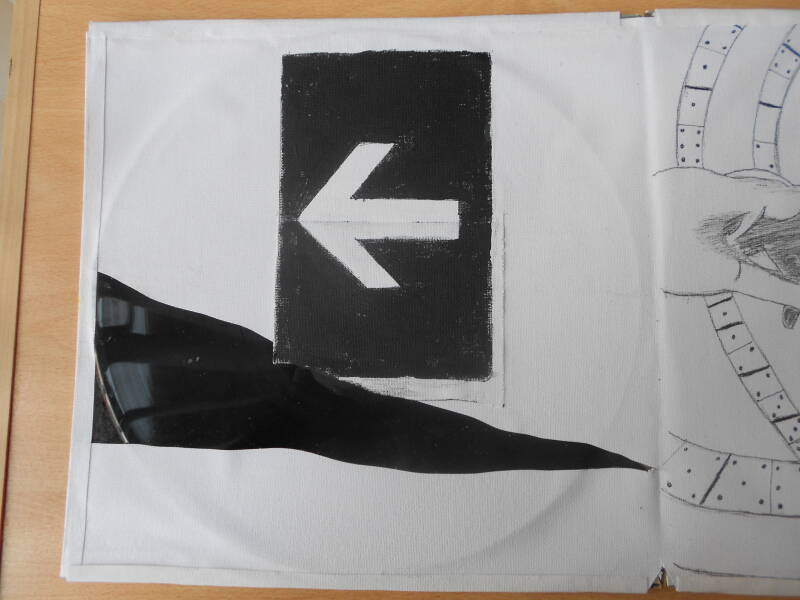
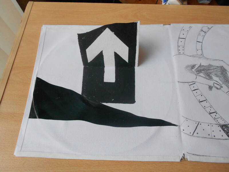
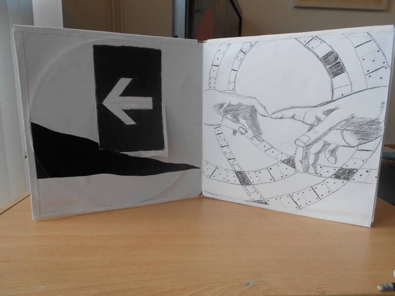
Chosen element 2: Left
This is literally on the left as we open the gatefold. An interactive image. The music connection here is John Lydon of the Sex Pistols and later collaboration with Leftfield. That collaboration ("Open Up") is the inspiration for this piece. Combining the arrow symbols for left, it "opens up" to show the up symbol. The tear across the sleeve is reminiscent of the hostage punk art style of Never Mind The Bollocks, Sex Pistols' only studio album.

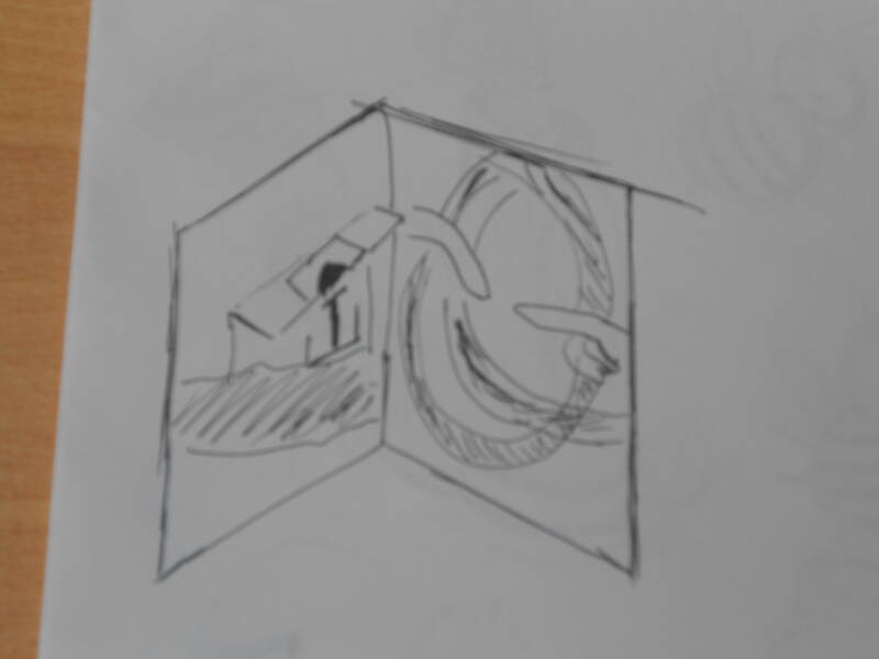
Chosen element 3: Michaelangelo
As seen in the image above, this element forms the right side of the gatefold. We are back in Florence with this one! The main subject are the hands from Michaelangelo's The Creation of Adam (c.1508), an event in the book of Genesis in the Bible.
I took this to mean both the band Genesis and an 'Invisible Touch', an album by the band. On that album among others is the track Domino, which is the pattern I use in the background. The shape is the interior of the dome where Michaelangelo's David sculpture is housed in the Galleria dell'Accademia, Florence.

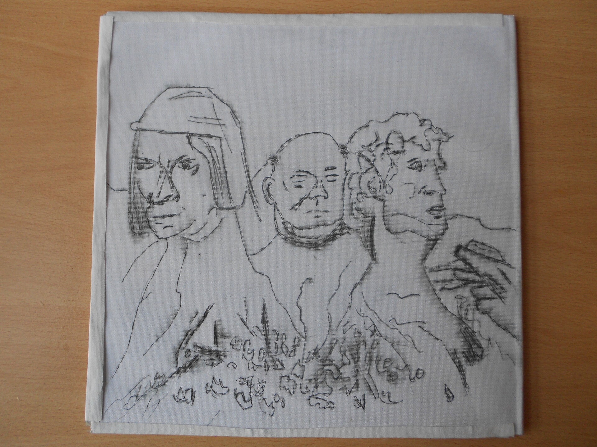
Chosen element 4: Lorenzo
Rear sleeve of the LP. Styled on Deep Purple's In Rock album (1970), itself styled after the Mount Rushmore sculpture of presidents.
The 3 portraits are (l-r): Lorenzo de' Medici ['The Great' / 'The Magnificent'], Lorenzo Ghiberti and David.
Lorenzo de' Medici was the 3rd generation of Medicis to be an art patron. Lorenzo Ghiberti was among the first to be commissioned by the Medicis to create the doors of the Florence Baptistery from 1400. David is the famous Michaelangelo sculpture, who himself was facilitated commissions by Lorenzo de' Medici, and lived with the family for 3 years.

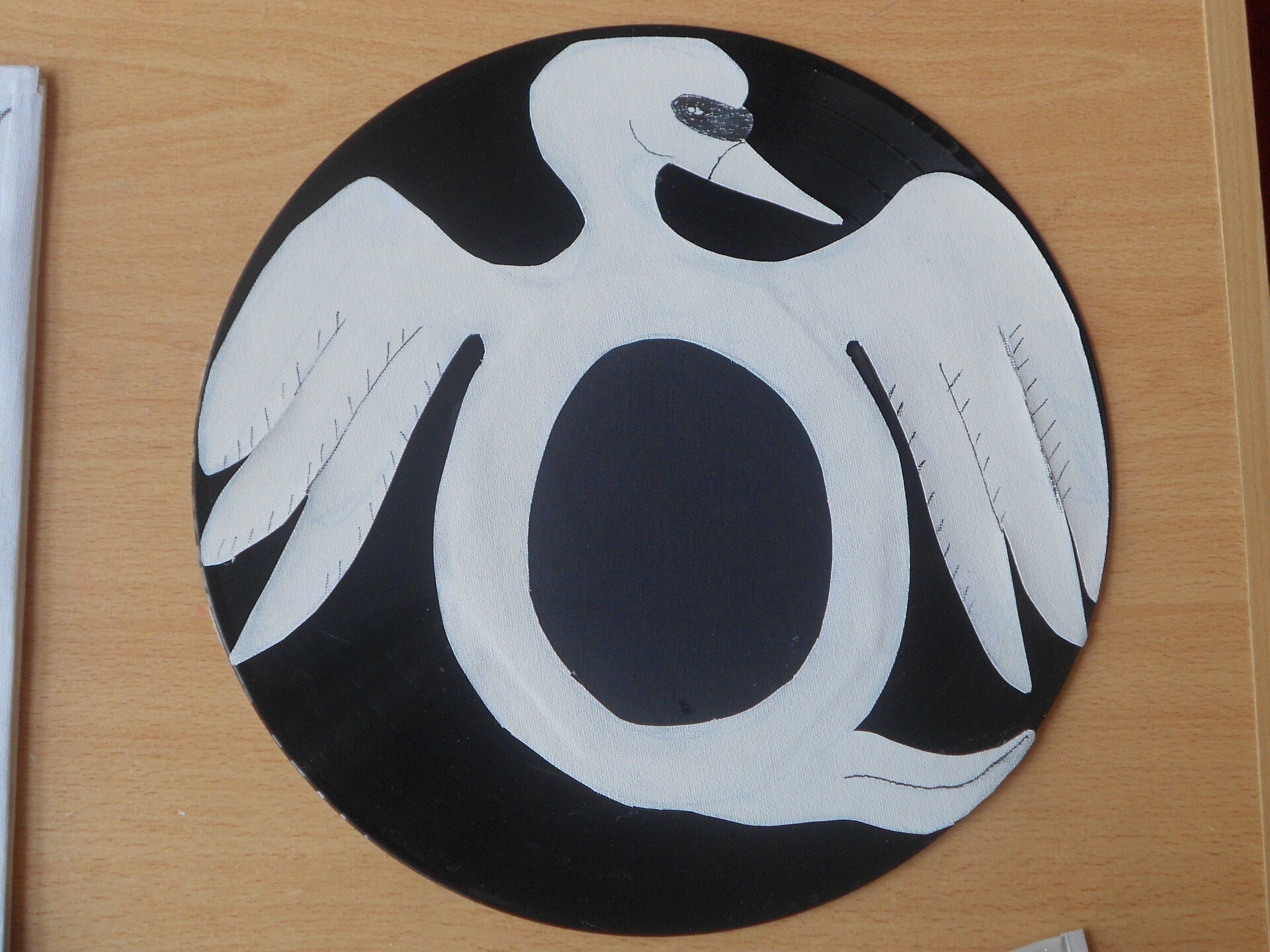
Chosen element 5: Opera
Opera as we know it was a Florentine invention. Having researched specific elements from this art form, I designed a stylised version of swan after Queen's Night At The Opera album (1975). The swan being a specific symbol of opera.
This image is on the record itself.
Once again, Florence not being singled out as a chosen element, but present in the design research.
Chosen element 6: Proofreader
The B-side!
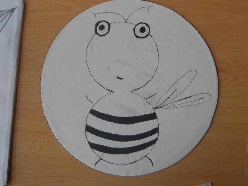
My thought process on this came from 'proof' and a general theme of law. Sting, lead singer of the band The Police, as an English teacher before finding a career in music was very much a reader. The Police themselves have a number of songs on various albums related to crime or illicit activity: Roxanne (prostitution), Don't Stand So Close To Me (paedophilia, references the book Lolita), Every Breath You Take (stalking).
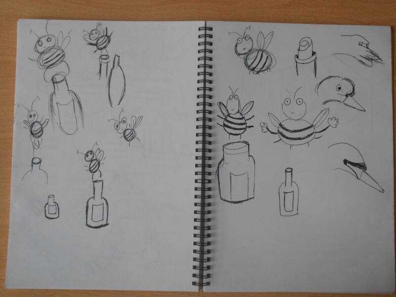
Gordon Sumner gained his stage name after wearing a black and yellow jumper resembling a bee. The record itself continues the theme of animal characters.